Yesterday I mentioned a fabulous site for envisioning the swirl and flow of winds around the world. Seriously, if you haven't seen it, and if you have any interest in the geophysical world, take a minute now to check out the Czech-originated site Windyty.
Okay, glad to have you back. Here are several followups:
1) Oceans have currents, too. From a professor at a major state university who specializes in fluid dynamics:
As a working scientist whose curiosity was sparked by the New York Times science section in high school, I greatly appreciate seeing more science-related content in venues read by “laypersons."
NASA has done a similar thing with the ocean currents that is truly amazing. It may be worthwhile to share with your readers.
Indeed it is! This NASA project is the source of the image at the top of this post. I don't see a way to embed its videos, but if you go to the NASA site here, you'll be able to see a range of fascinating high-res, high-amazement representations of ocean flows.
2) Flows go up and down, not just side to side. From a Ph.D. meteorologist with NOAA:
With respect to those visuals of rivers of air, it's worth being aware that there is one dramatic simplification at work in such figures, namely that the motion is portrayed as only horizontal. It is, of course, not just horizontal, and not just because of the flow over mountains.
At any given time, there is probably 1 cm/sec large-scale vertical motion on average a few thousand feet above the ground. While that may not seem like a large quantity, suppose the typical wind a few thousand feet up is order 10 m/sec. This means that for every 1000 m (1 km) traveled, that air will change in height by 1 m, and thus for every 1000 km the air will change in height by 1 km, if the vertical motion is consistent along the trajectory of that air.
So, on a diagram like the ones you showed, in actuality an air "parcel" that you might be tracking from Hawaii may end up whisked away at 10 km altitude, with a very different speed and direction than at the surface, by the time it reaches the west coast of the U.S. And similarly, the surface air along the West Coast may have come from somewhere very different than implied by such a diagram.
And thank the Flying Spaghetti Monster for those vertical motions, for that's what brings us the rains and snows (on ascent) or what clears out the smog after the passage of a cold front (the descent of clean air from high aloft).
3) Envisioning the layers of the atmosphere. The weather is way more interesting to me now than it was before I was spending time planning flights through it. Not weather as in, "Nice day today," or, "Hot enough for you?" But weather as in, "How low will the ceiling be?" Or in the wintertime, "Where is the icing risk?" Or in the summer, "Where are the thunderstorms?"
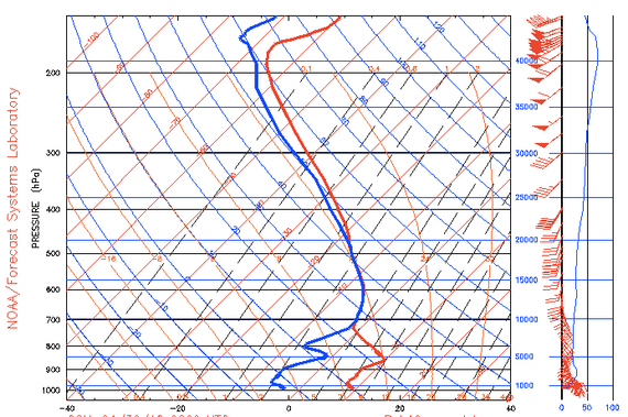
A radically useful tool for answering these questions is something known as a Skew-T Log(p) chart, a sample of which you see below. It represents soundings from weather balloons, which measure changing temperature, dew point, wind speed etc. as they ascend toward the stratosphere. As I say, these charts are very useful, but to put it mildly they take some getting used to. You can find introductory material here and more advanced material here The Skew-T chart below basically tells you: If you fly between altitudes of about 10,000 and 20,000 feet, you're likely to be inside a cloud at temperatures just below freezing, and therefore in danger of airframe icing.

One of the features of the great Czech Windyty site mentioned earlier is that it presents some of the same underlying information on a local basis (with analysis from meteoblue in Switzerland). For instance, here's the way it shows likely cloud layers over Chicago this week. The middle row, which I've highlighted, shows likely altitudes of cloudy and clear layers, as the week wears on. The Skew-T has its function, but so does this.

4) Your tax dollars at work. David Ryan, who under his nom de blog Tony Comstock was a guest blogger here back in 2011 and who in his role as charter-boat captain pays attention to the weather, writes:
It might be worth mentioning that the data for that and (nearly) all other private weather outlets comes from government sources. Here's the one I use: https://www.fnmoc.navy.mil/wxmap_cgi/index.html. And here's the European consortium:
The visualizations are cool, but they aren't possible without the data!
This article was originally published at http://www.theatlantic.com/technology/archive/2014/12/fluid-flows-in-the-air-and-on-the-seas/383787/
