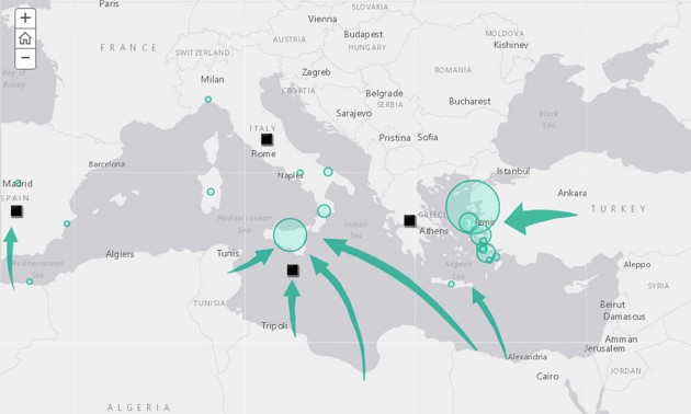
The image above is a screenshot from a new interactive map produced by our friends at Esri, the Geographic Information Systems (GIS) company that has been one of our partners in our American Futures reports. Esri specializes in interactive maps that present information of public, community, or commercial significance in newly comprehensible ways.
This latest map, which you can find by going to its home site or checking the embedded version below, dramatizes several aspects of the current crisis, including the routes of in-migration to Western Europe and the dimensions of the problem around the world. There is a lot to see by exploring, and zooming in and out on, the interactive version of the map.
I recommend either using the navigation arrows at the bottom of the map below, or starting with the icon in the upper left-hand corner, which will guide you to its component views and sections.
And here is one more screen shot, showing the size of refugee populations in different countries.

This is a case in which a (geographic) picture replaces many words. Worth checking out.